Borovets Ebikes

The challenge
Borovets is best known as a ski destination, which means its summer economy has to fight harder for attention. Borovets Ebikes needed a brand that could stand on its own for the summer tourist — adventurous, outdoor, mountain-first — while still feeling at home in a resort town crowded with generic rental shops. The identity had to work across signage, rental kiosks, a booking site, and social content, and speak to two very different audiences: families looking for a low-effort day out, and riders chasing real trail kilometres.
The work
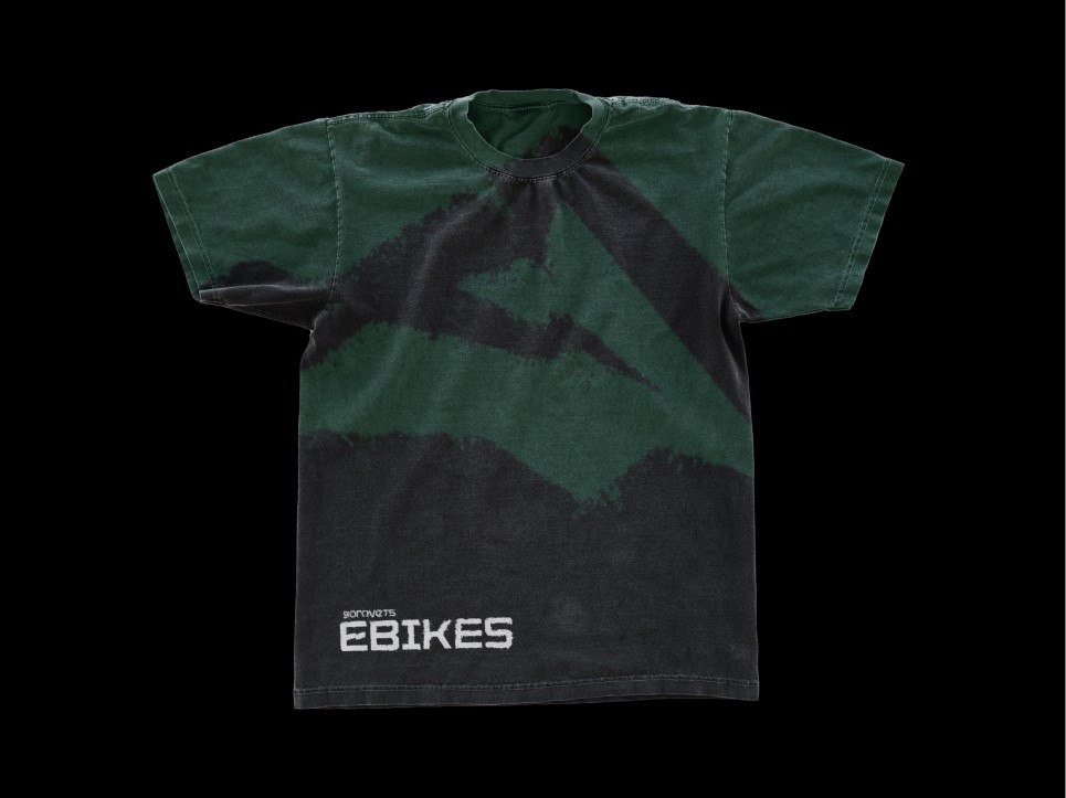
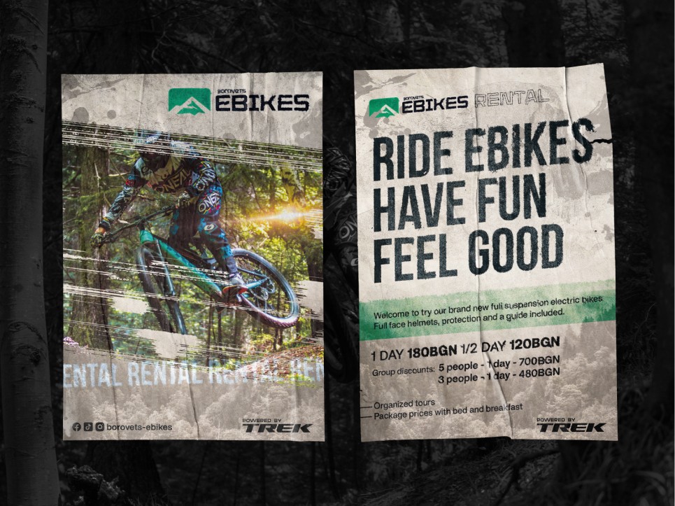
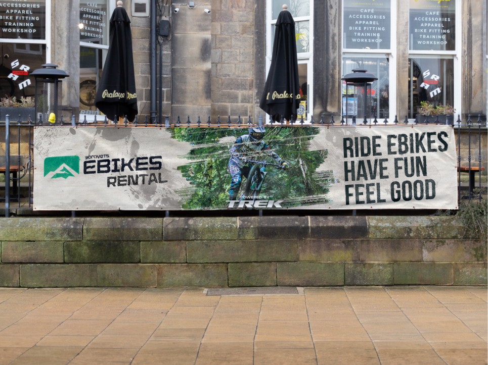
I built the brand around the mountain itself — the Rila range, the pine forests, the shifting alpine light — rather than around the bikes. The visual system leans on confident, outdoorsy typography and a palette pulled from the landscape: deep greens, cool stone, warm accent tones for wayfinding and calls to action. The logomark is simple enough to read on a helmet sticker, a map pin, or a trail sign without losing personality. Across the website and rental touchpoints, the tone stays direct and practical — what you can ride, where it goes, how long it takes — because that's what tourists actually need.
The result
A brand that feels like it belongs to the mountain, not to the parking lot. Borovets Ebikes reads as credible to serious riders and unintimidating to first-timers, and gives the business a consistent face across every touchpoint a tourist meets before, during, and after their ride. It turns a rental transaction into an outdoor experience, which is exactly what a resort-town ebike brand needs to do.
Services
Branding
Client
Borovets Ebikes
Credits
Denis Dimitrov
Year
2023